2021’s Colors of the Year Unveiled!
December 29th, 2020 by tisner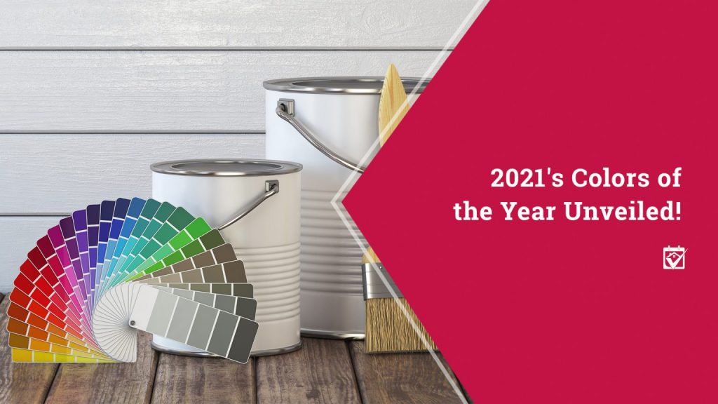
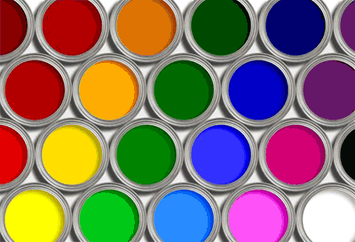
Everything has its season, and for paint, winter is that time. Year after year, paint companies release their chosen Color(s) of the Year, which are meant to be reflections on trends that are coming to interior design near you. If you’ve been considering repainting a bedroom or your whole house, knowing what’s in can help you narrow down the impressively huge list of paint options available.
Bold Tones Are Where It’s At
2021 continues the trend that’s been taking us far from the subdued hues that have been so popular in the past. Instead of neutral palettes, homeowners are going big or going home. That doesn’t mean the paint scheme in every house has to be glam, but it does mean that it’s ok to put a little personality out there. Pops of color are glorious when done properly and no longer the sale killer they may have once been. But it’s not exactly a revisit to the 1950s. Color should be used more strategically to create a big impact, highlight features in your home, and influence the atmosphere in living, dining, and sleeping spaces.
Drumroll Please….
Most of the major paint companies have announced their colors for this year, though a few are still waiting for 2021 to roll around. Of those that have made it official, you’ll notice a big trend in color themes. Blues, pinks, and grays rule the day, though they’re not your grandma’s retro flavors.
Pantone: Ultimate Gray and Illuminating
One of the top names in color has come up with one of the top color combos for 2021. It’s a whole mood, really, and sums up 2020 pretty well. Ultimate Gray is a light neutral gray color that would be at home in almost any space. Illuminating, however, is a bright, determined yellow that should be used in small doses. As Pantone’s executive director, Leatrice Eiseman, wrote in a press release about the decision, “The union of an enduring Ultimate Gray with the vibrant yellow Illuminating expresses a message of positivity supported by fortitude.” It’s also way eye-catching.
Rust-Oleum: Satin Paprika
Do you dream of the desert southwest? Or maybe you already live there and want to bring a bit more pop indoors? Satin Paprika may be the answer. This coral red, spicy earth tone is the anchor for three distinct color palettes that Rust-Oleum has developed for 2021. It’s gorgeous in a variety of spaces, works with many different colors, and, frankly, it brings to mind the red stone that’s so common in the desert. Your succulents will feel right at home.
Glidden: Aqua Fiesta
Glidden zigged this year when a lot of the other paint brands zagged, and named Aqua Fiesta its Accent Color of the Year. It’s a bold, but not overly bright, aqua color that goes great with both light neutral browns and grays, allowing it to dress up all kinds of spaces. You might feel like taking an island vacation or dream of mermaids after painting this one on, though.
Benjamin Moore: Aegean Teal
Benjamin Moore was also feeling a bit blue when choosing 2021’s color of the year, but more blue than green, which resulted in a gorgeous dark robin egg-esque color. The gray undertones make it a great accompaniment to the popular gray neutrals, and the more strict blue gives it a bit of a grown-up feel. It’s a super calming color in any room and will even pair well with yellows.
HGTV Home by Sherwin-Williams: Passionate
Blue isn’t everybody’s thing, and clearly HGTV Home by Sherwin-Williams agrees. It chose Passionate for its 2021 Color of the Year. This is a deep carnation, but not quite red, sort of color that looks awesome with earth tones and tans. It’s the kind of color that you may have never expected to like, let alone paint in your home, until you see it in action. Accent it with other bold tones and your humdrum room will absolutely be transformed.
Sherwin-Williams: Urbane Bronze
Looking for deep, rich color that won’t leave anyone guessing about your intention for your space? Urbane Bronze is a color that will define a space without regrets. It’s a warm gray-brown that goes well with a range of flooring and lighting, but stands up on its own without the need for a lot of fanfare. You might not want to use this on every wall, as it may have a way of making your space feel a bit small, but your accent walls and accent pieces will absolutely thank you.
Valspar: Hues of the Year
Valspar couldn’t pick just one, so instead went with a whole range of colors for the year. It chose 12 muted colors; these are colors that could be considered “barely there,” just a hint of bold for a room that isn’t ready to go all in. These subtle choices range from misty blue to a warm apricot, with buttercream, green, beige, and gray also on the menu. Use this palette together to create a wholly harmonious space.
Ready to Get Painting?
Choosing your colors is only the first step to getting that big paint job done. If you need some help finding a painter who will knock it out of the park, don’t hesitate to ask your HomeKeepr family for a recommendation. After all, it’s an awfully good feeling knowing that someone you believe in trusts the painter that’s going to make your dreams come true.
Access Teri’s one-stop Orlando FL home search website.
Teri Isner is the team leader of Orlando Avenue Top Team and has been a Realtor for over 24 years. Teri has distinguished herself as a leader in the Orlando FL real estate market. Teri assists buyers looking for Orlando FL real estate for sale and aggressively markets Orlando FL homes for sale.
You deserve professional real estate service! You obtain the best results with Teri Isner plus you benefit from her marketing skills, experience and ability to network with other REALTORS®. Your job gets done pleasantly and efficiently. You are able to make important decisions easily with fast, accurate information from Teri. The Orlando Avenue Top Team handles the details and follow-up that are important to the success of your transaction.
Get Orlando Daily News delivered to your inbox! Subscribe here!
By: Homekeepr, David Weinstein